The Windows Phone UX guidelines have just come out, and they make for interesting reading. Read on for a few quick comments on items of note.
Also, check out Luke W’s writeup of the Windows Phone UI and Design Language presentation from MIX10. Some of the points raised there (obviously) come through in the UX guidelines doc (official title: UI Design and Interaction Guide for Windows Phone 7 Series (pdf)).
Novel Interactions
First off, while the touch gestures obviously borrow a page or 200 from Apple, there are two slick little UI interactions/features that seem pretty novel.
One is, Panorama Application allows for apps that stretch beyond the dimensions of the phone, allowing a user to pan across the an application that is “wider” than the phone. Seems cool…I wonder how usable / useful it really will be in practice.
Second, Pivot Control allows for “filtering large data sets, viewing multiple data sets, or switching application views.” It’s basically a nifty way to pan across multiple viewing options which then affect the view that appears on the page below. This is especially handy for large filter sets…you don’t need to squeeze the type in to the width of the phone dimensions, you can just use the pivot control to pan across them and make your selection. Not bad.
Type Geeks Swoon
Font nerds will exult at the following sentence, at the top of paragraph 1 in the guidelines: “The [UI] design principles center on a look that uses type to echo the visual language of airport and metro system signage.” (p1). Type! AND public transit! In one UI! Pardon me while weep with joy!
Nerdism Comes with a Cost
They’re serious about that type. Changes to the UI are apparently limited colors only; specifically “background colors and accent colors.” (p 27). No type changes, no layout changes, nada. Hope you like airport signage, buddy.
Real World? No Thank You.
They don’t dwell on it, but there’s an interesting aside that “You should use digital metaphors where appropriate and do not necessarily try to mimic real world interaction if it is not appropriate.” (p6) This would appear to be at odds with the iPad’s movement toward mimicking the natural world, and I’m inclined to agree with Microsoft (did I just say that?).
Make it Smoov
The guidelines stress that movement and transition of the UI should be smooth, with no lag time (p7). They could just as easily have said: “Make sure it’s as smooth as the iPhone.” But, that’s a big deal. I’ve got my problems with how Apple is a fearsome gatekeeper for its devices, but the iPhone UI is absolutely silky smooth. I want to like Android, I do, but it lags. iPhone doesn’t. We’ll see if Windows Phone can measure up.
Oh, That’s How I Pinch and Stretch?
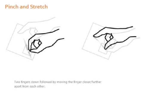
The guidelines have nice little graphics of the supported touch gestures, like:
Near as I can tell, there’s almost nothing “new” here that iPhone doesn’t do. “Touch and Hold” perhaps, as it calls up context menus or options pages, which iPhone’s don’t have.
The Back Button That Never Goes Away
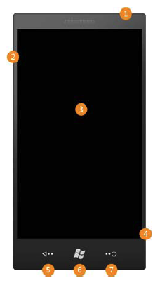
Windows phone will have a hardware “back” button, which I’m increasingly fond of after playing with Android phones. It’s nice to be able to have that “back up” ability in your app without having to take up space for it on every single page of the app.
Make the English Professor in Me Smile
There’s a entire section on “voice and tone” of the writing in your app, and on proper capitalization and punctuation! It’s like I died and went to copy-editor heaven. Sure, it’s at the very, very end, where no one will read it, but still!
In Summary
So of course I haven’t even played with the UI yet, and they were hardly the first to produce UI guidelines for mobile devices, but I think Microsoft has done a nice little job here. We’ll see how it plays when the phones actually come out, but I would make this observation: Windows Mobile 6.x has roughly 15% market share, and it’s terrible! Just awful! I’d say that if Windows Phone is even half as good as it looks, MS could start gaining market share again.
Filed under: Uncategorized | 3 Comments
I finally got around to reading the iPad Human Interface Guidelines. I am of course impressed by Apple’s dedication to producing interface guidelines for its community of developers and designers that are clear and straightforward. I’m also impressed at the thought Apple has put toward how the iPad experience should be deliberately different than an iPhone experience, even though the UX of both are generally similar.
However, a few notes of concern:
I’m apprehensive about the repeated emphasis on making UI ojects “look more realistic”
This comes up repeatedly throughout the doc. Apple is really pushing the idea of making interface elements look realistic, look exactly like what a similar object would look like in the real world. For instance:
“…on iPad, Contacts is an address book with a beautifully tangible look and feel.” p. 17
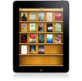
Further, pics of the iPad have been making the rounds showing a wood-grained bookcase, and a calendar with wire bindings.
So what’s wrong with a little realism?
Well, at its worst, emphasizing photorealistic UI objects can lead to a cheeseball bonanza of 3D, spinning, and blinking objects, harking back to the day of mid-’90s CD-ROMs where that stuff was everywhere (yes, I’m old).
More importantly, it’s a long-standing tenet of UI design to emphasize minialist design, removing as much as you can from the UI until you are left with only what you need to communicate actions and affordances to your users. Extra noise in the UI is just that….extra noise that makes it harder to see the what you, the user, need to manipulate to get something done.
Now, to be fair, Apple does say that it’s more about adding “realistic touches” to your UI, and “don’t feel you must strive for scrupulous accuracy.” Still, I must say I frankly find that bookcase up above pretty ugly and hokey, and the insertion of realistic elements into UIs introduces more risk in terms of creating a UI that simply disagrees with a user’s aesthetic tastes, let alone, possibly, making things harder to use.
I’ll post a few more kvetches in the days ahead. I’d be curious to read your reactions….let ’em rip.
Filed under: Uncategorized | 1 Comment
This is the first installment in a series that will compare how various smartphone UIs approach UI conventions. I hope you find it interesting, although truthfully I’m doing it mostly for myself so I have a handy set of screenshots to access for comparing how a Blackberry does X compared to Symbian, or Android, or whatever.
In addition to the screenshots, I’ll try to comment on anything that strikes me as interesting…but feel free to pitch in in the comments. So, we’ll start with:
The Status Bar
The status bar is perhaps the most ubiquitous UI construct across smartphone UIs: It’s the little bar at the top that shows battery charge, carrier signal, time of day. On some platforms it is merely an information display, but on others it has some interactive elements. Let’s take a look at a few…
iPhone
The iPhone status bar is a simple information display: Signal strength, carrier, time, charge, and assorted other icons. It doesn’t have any interactive elements.
Android
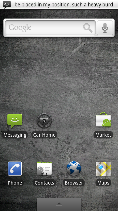
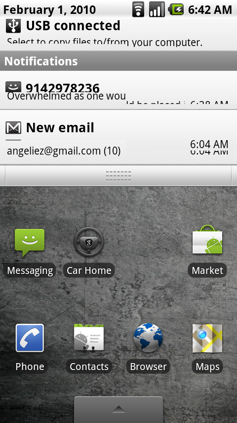
Motorola has taken shots at the iPhone OS in its Droid ads, pointing out that the status bar on Android phones alerts users to incoming messages or other things. I’m of the opinion that it’s a worthy criticism of the iPhone: The modal nature of the iPhone alert pop-ups can be a distracting experience whereas the Android interface does a nice job of subtly alerting a user to incoming items of interest.
When a user touches the status bar, a drag element appears, suggesting that the user can reveal more from the status bar (this is especially hand if you want to find out more about that new text message).
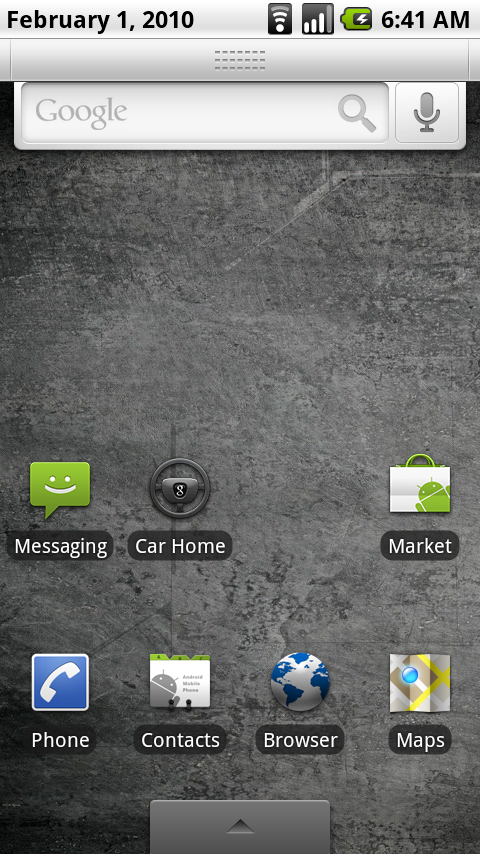
When touching the status bar, an element appears suggesting that the user can drag the status window down.
So, let’s drag the element down:
And here we are with the fully expanded alerts window, with a menu of things that could use my attention. All in all, I think Android does a very good job of subtly alerting the user to incoming alerts, and allowing them to view all alert items in a single place with a simple touch-and-drag gesture.
webOS
I know most people have written off webOS already…Palm just has no hope of competing against the other big phone OS players. Probably true, I guess, but I really enjoy the webOS. It just seems fun and pleasurable to use, although it’s not as smooth as iPhone or Android.
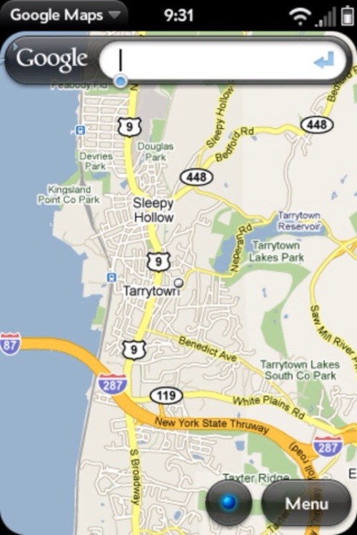
The webOS status status bar of course shows time, carrier, bars, etc. in its top pane. When alerts such as text messages come in, they are displayed in a scroll at the bottom.
Interestingly, the status bar starts to do double-duty when an app is opened, offering the app name as a touchable element as part of the status bar. Touch the element, and a contextual menu for that app opens.
Blackberry
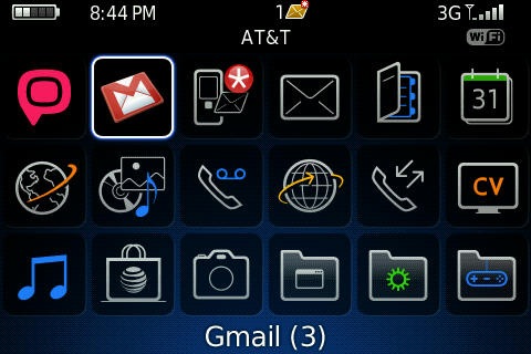
Blackberry? You get the usual stuff in the status bar, plus alert icons. Done and done.
Symbian
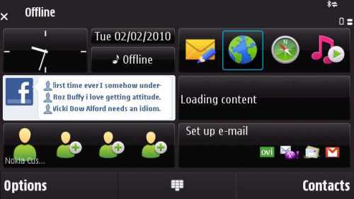
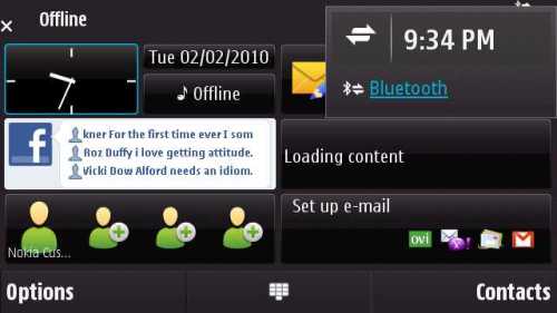
I’d never played too much with Symbian phones before stealing the office N97 to take some screenshots, and I must say it’s s somewhat underwhelming experience. The whole touch experience just seems very wonky and it’s easy to get lost in the UI.
The status bar is similarly inscrutable. I’m pretty sure the battery was fully charged when this image was taken, but you could hardly tell. And what does the X to the far left mean? No signal, maybe? Weird.
Also strange is Symbian’s interactive element. Click to pop up and see…the time?
WinMo 6.5
WinMo 7 is supposed to come out…when? Soon? Anyway, the much-maligned Windows Mobile 6.5 isn’t so bad really, I think. It kind of acts like Windows (duh) so if you know your way around a PC then it’s not so bad.
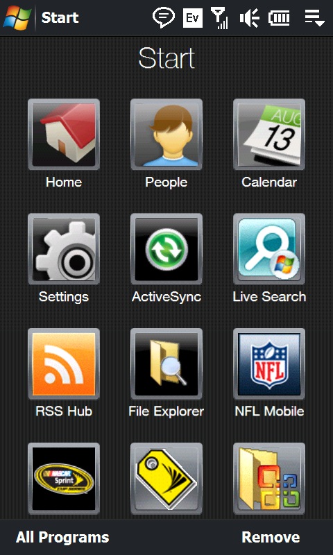
The status bar as what you’d expect in terms of various status icons. The “Start” in the upper-left corner is touchable, as you would expect from using a windows machine, but the behavior is different. Touching “Start” toggles between a general wallpaper page (with clock) and a list of apps. It’s a little strange to try to use a UI convention from windows that has a certain expectation, and then see it behave differently on the phone.
The far-right of the status bar is clickable, and hows the apps currently running, similar to the windows task bar.
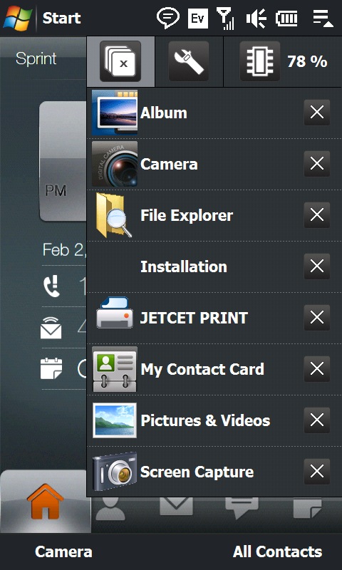
Showing currently running programs after clicking in upper right. This is handy for hopping around applications. (Multi-tasking! Yes!)
Last Word
So, which of these is the best?
- I definitely like how Android uses the status bar to subtly alert the user to alerts, and makes the status bar expandable to see all alert/status items that the user may wish to see.
- And I like how WinMo makes it easy to hop between whatever apps the user has open.
Let me know if there are future UI conventions you’d like me to investigate, and thanks for reading.
Filed under: Uncategorized | 27 Comments
Tags: design, os, smartphone, ui
Re-start!
Sorry, I’ve let this blog languish as I’ve transitioned to a new job and a new field of technology. Since July, I’ve been working on the user experience team for Fox Mobile Group, where we’re doing some interesting things on, yes, mobile phones.
Now I’m ready to start blogging again, and the blog will swing a bit away from social networking and social technology to mobile technology…although there’s plenty of crossover between the two.
Among the first blog posts, starting soon, will be a series of screenshot-by-screenshot comparisons on how different mobile OS’s approach particular UI constructs.
But first, figured I’d repost a quick article from MobileCrunch that echoes some of my thinking on whether mobile apps are long for this world, as compared to easier-to-develop-and-distribute services that run in a mobile browser.
Check it here: http://www.mobilecrunch.com/2010/02/03/mobile-web-may-beat-out-mobile-apps-in-the-long-run/
Nice to be back; see you soon.
Filed under: Uncategorized | Leave a Comment
What, you want more yammering on activity streams? My friend, look no further.
I got to thinking: what is the scanning behavior for users looking at an activity stream? More specifically, when scanning a stack of activity feed items, what visual cue is the user looking for to indicate that a certain feed merits more attention? And what does that imply for how activity feeds should be designed?
If we’re to go by the current trend in activity feed designs, author, or, more specifically, an iconographic depiction of author, is most important. The designs of Twitter, MySpace, and Facebook feeds all feature a profile photo prominently on the left-side of each activity feed item (and remember, the eye scans left-to-right, so the picture is what people see first).
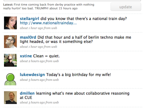
Twitter feed with author pics as main differentiating characteristic.
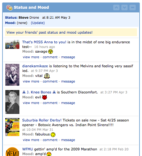
MySpace feed, also with author pics as main differentiating characteristic.
This makes sense for these apps, since the content of these feeds is mostly homogeneous. With Twitter, merely status declaration. With MySpace: Same. Thus, one can scan and select to read based on how much one actually cares about the author of the activity bleep.
With Facebook, though, it’s a little more complex, as users are also posting links to images, Websites, and whatnot, in addition to simple declarations of status.
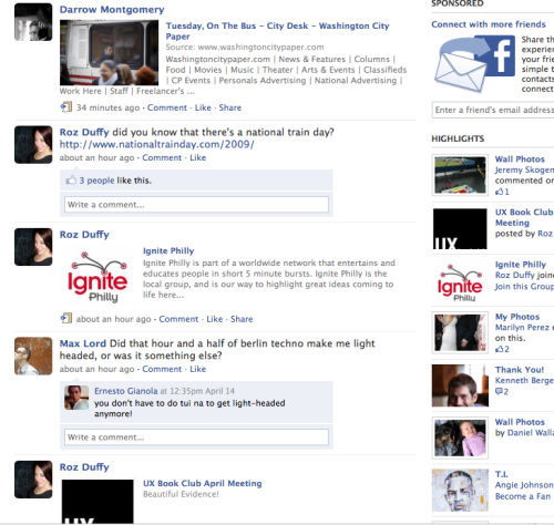
Facebook feed, also with left-hand author images, but more variance in what appears in the feed (links, video, images, etc.).
That heterogeneity of content starts to make the feed more visually confused and difficult to scan. In fact, I would argue the various graphics and links start to overshadow the simple status declarations.
Which brings us to Friendfeed. When it launched, FriendFeed’s design implied that it was actually the originating application that was most important. You could scan app icons for Twitter, or del.icio.us, or whatever, and then read title and author if the application was something interesting to you.
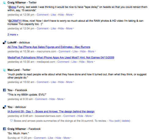
Old FriendFeed design, placing emphasis on icons for the originating applications.
But now FriendFeed has switched to be more Twitter-like, with author images as the key differentiating aspect of each activity bleep. The originating app is significantly downplayed.
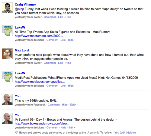
New FriendFeed design, emphasizing author images.
What’s interesting here is that the implication is, again, I only really care about the author of the bleep, and much less than in where that bleep originated from.
Alright, back to our questions. “When scanning a stack of activity feed items, what visual cue is the user looking for to indicate that a certain feed merits more attention?” Well, in FriendFeed or any other heterogeneous activity feed, I would argue that the reader is equally interested in: author, originating application, and title of the bleep.
This would go doubly in, say, the enterprise context, where I might be much more interested in seeing all activity from, say, a wiki, and filter (in my mind) next on author or title.
Next question: “What does that imply for how activity feeds should be designed?” Well, a good design would be able to allow users to self-select what they’re scanning on, any of those three characteristics, and allow equally easy scanning, depending.
What would that look like? Well, uhhh. Here’s a quick stab at redesigning the FriendFeed stream to allow users to scan on any of those three characteristics.
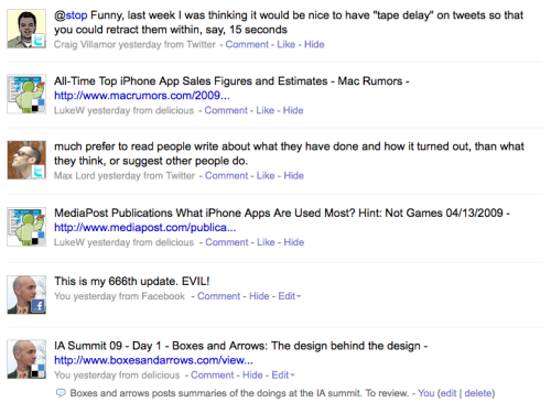
Five-minute redesign of FriendFeed.
Essentially this design makes the following arguments:
- The mind will still scan primarily on author icon. The embedded originating-app icon will give a bit more context before the user scans the item title.
- If author icon and app icon were enough to pause the reader in his scan, go straight into the item title where user can get full information.
- Note that author name is significantly downplayed (in gray at bottom rather than large link in front of item title). This assumes that once you see the icon, you know who the author is, and repeating it just gets in the way of the scan.
Not sure it really works, but I do think that depending on the intent of the user, it’s difficult to say categorically that author or originating app or title is most important, so a good design should be able to communicate all three. Thoughts?
Filed under: Uncategorized | 4 Comments
Seems like you can’t swing a dead cat around without hitting someone that’s got an activity stream built into their app, or their app is a an aggregator of activity streams. Not surprising. Twitter is enormously popular. People looove to read those tweets. This is affecting how other consumer products look at their activity UIs.
But is there, perhaps, going to be a backlash to the total information awareness wrought by having to read all these streams? Some thoughts:
Facebook rolled out its new design recently, basically making the homepage much more Twitter-like. Result: Everyone seems to hate it. I know that I personally am much more aggressively “hide”ing people in Facebook that I don’t care about (and that is, frankly, most of my connections) because I just can’t deal with all the overload.

Facebook's Twitter-like new look. I need to hide annoying people more aggressively.
Friendfeed, which is kind of an uber-aggregator of activity feeds from Facebook, Twitter, Flickr, etc. etc., has rolled out an interesting new UI at http://beta.friendfeed.com. This thing will actually show LIVE updates of your friends’ activity feeds, and, if you’ve got enough friends, will get going so fast you can’t keep up with it. They had to add a “pause” button!

FriendFeed's new Twitter-like interface. Note the "pause" button, upper-right.
Finally, consider how recently even CNN cleaned up the “UI” of their TV broadcast, removing all that constant ticker junk. They think that people are getting tired of it.

New, ticker-less CNN graphics.
Jeremiah Owyang has a quick, nice piece on how UI needs to do a better job of helping users sort the activity stream in a way that makes sense to them. Sure, definitely, but harder to do than to say. Check Jeremiah’s thoughts here.
So hey, here’s a contrarian thought: Are activity streams just another goddamn email inbox? And when they get choked with too much data, will we just stagger like zombies to some new UI/service that seems like The Solution but is actually desirable merely because it’s not clogged with crap yet?
Filed under: Uncategorized | 5 Comments
I’m building this post as a personal cheat sheet for Data Portability efforts in social networking. Coz I can’t keep it straight. Give me a few days to construct it, at which point I’ll probably make it a separate page on this here blog.
Please let me know if you see errors, or have comments. Frankly this stuff is pretty confusing; I’m happy to have any mistakes corrected.
So, data portability in social networks is about sharing data about users (name, favorite band, who your friends are, etc.) among different Web sites and different social networks. Specifically you can think about data portability in the following ways:
- Who I Am (authentication/ID and profile info)
- Who I Know (social graph)
- What’s Going On (feeds of personal and friend activity)
- App Portability (sticking apps/widgets on other networks)
Further, it’s useful to think about those bulletpoints in terms of:
- Data In (to your own social network, say, SelectMinds corporate social networking apps)
- Data Out (to other networks, say, LinkedIn or Facebook)
Now, there are basically four horses out there. The Open Stack including OpenID, using (mostly) open standards to accomplish data portability; Google Friend Connect and OpenID which uses both the open standard OpenID and Google’s Friend Connect; Facebook Connect and the Facebook APIs, being used by Facebook and various sites that want to cash in on the Facebook mojo, and MySpace’s MySpaceID. On the outside is LinkedIn, which is keeping its user data tightly held, although it is opening up a bit.
Finally, on the enterprise side, Google and Salesforce.com are getting very cozy, while Microsoft’s Sharepoint is still in the realm of talking only to other Microsoft apps, or one-off integrations.
More on all this below…
The “Open Stack”
This mishmash of open standards is recently become somewhat subsumed by Google’s efforts with FriendConnect, but I decided to list it separately for clarity’s sake.
Who I Am
- OpenID
-Single ID, authentication, across many sites
-Alleged profile-attribute sharing as well
-Used by Yahoo, Google mail, Windows Live, Plaxo, hi5, etc.
Who I Know
- Contact APIs (such as Google Friend Connect (?))
- OAuth (Share private data between trusted sites)
What’s Going On
- RSS/Atom: Syndicate your activity to share with others
- Jabber/XMPP: Real-time update stream between sites (esp. for “status”)
App Portability
- OpenSocial (Owned by Google, which is pushing it as an open standard)
Google FriendConnect mated with OpenID
Google was an early booster for open standards for data sharing across social networks (which makes sense, as it was and is lagging far behind Facebook and MySpace in terms of social network usage). To a certain extent, Google FriendConnect now mirrors the Open Stack, but I thought I’d keep ’em separate. Details:
Who I Am
- OpenID for authentication and UserID. That’s important because of the many sites that are using OpenID for authentication. Basically, then, if your site uses OpenID, it can also leverage FriendConnect for social data and OpenSocial for widgets.
- FriendConnect for profile-attribute sharing.
Who I Know
- FriendConnect allows friend lists to be shared among any subscribing sites
- FriendConnect also supports OAuth data portability.
What’s Going On
- FriendConnect also has feed messages and other activity covered, allowing sharing of this info among subscribing sites
App Portability
- Open Social is the mechanism for placing app widgets on subscribing Web sites. Note also that Open Social gadgets can grab the social data from FriendConnect.
Facebook Connect and Facebook APIs
Facebook is the number 1 social network in the world, and fast gaining on MySpace in the US. So far, it hasn’t seemed inclined to play in the “Open” world.
Facebook allegedly has 24 launch partners for Facebook Connect, including Digg, Twitter, Plaxo, CBS. Unclear how many have actually taken it up. Here’s more on Facebook Connect.
Who I Am
- Facebook connect links Facebook profile attributes out to participating sites. Including image, and other profile attributes. Facebook connect is now open, allowing “any” third-party site that signs up to pull data about visitors from Facebook. Wow.
- Unclear if profile updates made at partner sites are pushed into Facebook.
Who I Know
- Facebook Connect enables pushing Facebook social graph information out to partner sites.
- Unclear if updates at partner sites push back to Facebook.
What’s Going On
- Facebook Connect also makes FriendFeed data available to other sites.
- And posts activity back into Facebook.
Portable Apps
- Facebook platform enables third-party developers to put their apps on Facebook, although this is an area of apparently decreasing importance for Facebook.
MySpaceID
MySpace has rolled out MySpaceID to try to catch up with Facebook. It lags behind Facebook Connect in some aspects. However, it largely embraces the Open Stack and Google Friend Connect, so could gain more leverage (read: everyone’s ganging up on Facebook). To whit:
Who I Am
- MySpaceID allows users to log into other sites using their MySpace credentials
- And allows for portability of profile attributes to other Web sites
- OpenID comptabile
Who I Know
- MySpaceID also allows for the use of social graph information on other sites
What’s Going On
- MySpaceID currently does not support publishing activity from other sites into MySpace, and publshing MySpace activity out to other sites. ETA is early 2009.
- OAuth compatible
Portable Apps
- OpenSocial
LinkedIn’s InApps
LinkedIn is only reluctantly getting into the API game, thus far only accepting a (very limited) set of third-party apps onto its site. No sharing of “Who I Am”, “Who I Know”, or “What’s Going On”. Bad LinkedIn! Thus, it’s really just:
Portable Apps
- OpenSocial-based platform. LinkedIn’s being picky about what business apps it accepts, although they’re all pretty lame so far.
Google and Salesforce.com
Comin soon….
Sources
Most of this piece is sourced from TechCrunch. Hey, they make it easy. Here are some of the articles that were helpful.
Filed under: Uncategorized | 3 Comments
I’m feeling bloody-minded and have been re-reading Don Norman‘s “Design of Everyday Things.” I got on this kick because I was annoyed at Norman’s article in the latest Interactions: in discussing “social signals” (indicators of status left by human activity–for example, an empty train platform indicating you’ve missed your train) Norman has unkind words regarding “affordances”, a cherished interaction-design concept.
Affordances basically suggest how one might interact with an object. Say, the holes on scissor handles suggest your fingers go there, or the beveling of a UI button suggest that it is something to be clicked on. While psychologist James J. Gibson coined the idea in 1977, Norman borrowed the concept for “Design of Every Day Things,” cited it continuously, and basically grafted the idea into the heads of a generation of interaction designers (like me).
Now, Norman is suggesting we “forget affordances” and concentrate on social signals. Okay, Norman’s a bomb-thrower, and he probably doesn’t really mean it. There’s nothing wrong with considering a range of concepts and theories when considering how best to design a set of interactions around an object or service.
BUT: Norman’s casual murder of affordances got under my skin, and I started re-reading “Design of Everyday Things.” I’m only two chapters in, but one of the things I’m struck by, now that I’m out of grad school and less of a usability zealot, is Norman’s apparent belief that any object should be immediately understandable and usable, and, by implication, Norman’s rejection of expert utility. Secretaries should not need to be trained to use advanced phone functions; film machines should be grasped by any ol’ schmo.
I may go to user-centered design hell for it, but: I don’t agree. There is a place for experts using machines tuned to their trained and developed sensitivities. Call me elitist, but I say: YouTube’s singular impact is to prove that most people shouldn’t be allowed anywhere near a videocamera.
This all made me think of Steve Albini’s (engineer of Nirvana’s “In Utero”, dontcha know) famous mid-’90s rant “The Problem with Music.” In the midst of a wide-ranging screed against the music industry, Albini complains that untrained “crappy engineers” are recording and producing music with (then) new, easy-to-use DAT machines. saying: “Tape machines ought to be big and cumbersome and difficult to use, if only to keep the riff-raff out. DAT machines make it possible for morons to make a living and do damage to the music we all have to listen to.”
I agree. Not everything should be user-friendly.
Filed under: Uncategorized | 6 Comments
Tags: usability affordances norman albini
Moderator: “Nothing says 8:30 a.m. on the last day of the conference like a math and theory-heavy session.”
Can Markets Help: Applying Market Mechanisms to Improve Synchronous Communication
CMU People. Natch.
Basic upshot: Sender does not now how costly interruption is to the receivers, and the receivers do not know how important the communication is to the sender.
Possible solutions:
- Full disclosure: disclose all information in communication. Problems: Privacy issues; people may not use the disclosed information.
- Payment markets (and the focus of this session): Can we utilize markets to improve communication efficiency, and how elaborate must hte market be to derive benefits?
So, how about if you put $5 on the value of the sent communication. Then receivers can filter out communication requests on price.
Benefits of market:
- Privacy is prserved
- Important and ugent communication wil have higher payments
- Receivers compensated for interruption.
Prior work has shown that markets can increase gains for senders and receivers. But, in real life, people aren’t very good at estimating things, estimating value.
So, they did a lab study. Participants come in and earn money by solving puzzles. they can ask for help from other participants. And communication (ask for help) is run on a no-price market, variable-price market, fixed-price market.
Results
- Market participants earneda bout a dollar more than no-market
- and the fixed-price market seemed to perform the best.
- Variable price market performed worse, but also was more prone to error and higher cognitive costs (assessing a number of prices)
- Variable price market had significantly higher time to make decision compared to fixed-price market
Interesting stuff.
Network Structure, Position, ties and ICT Use in Distributed Knowledge Intensive Work
Competing models/theories to explain technology use:
- Technology Acceptance MOdel (TAM)
- Social Influence Model
- Significance of social structural, position, and ties not well-accounted in the above models
So, what social structures affect ICT use?
Weak ties! Hearing a lot about that this conference.
And now, a completely impenetrable explanation of method. Oy, I am not smart.
Long Title: Investigating the Effcect of Dicsuiion Forum Affordances on Conversational Structures
Looking at thread structure of bulliten boards. Like, explicit or implicit threads.
Question: Is the way the discussion presented have an effect on how people internalize the discussion. (?) “Determine whtether these differences affect how people ‘talk’ ”
Investigate the contribution of “Time” and “Similarity”.
Basically they’re looking at “flat” (blog-like) thread structure vs. threaded thread structure and see if that has an impact on the language that arises.
What they found: People drop cueues to other text in threaded discussions, use them heavily in non-threaded discussion. SHOCKER!
Filed under: Uncategorized | Leave a Comment
Coordinating High Interdependency Tasks in Asymmetric Distributed Teams
Petra Saskia Bayerl and Kristina Lauche, Delft University of Technology
Challenges of remote teams
- Coordination of tasks and processes
- Technology restrictions
- Process and motivation losses
- Conflicts and trust
Whoah, they looked at offshore oil production teams and the control people onshore.
Study aim: coordination for highly interpendent taks in distributed teams in foffshore oil and gas production. Implications for technology support.
Cutting Into COllaboration: Understanding Coordination in Distributed Medical Work
Collaboration is important: when it’s distributed it gets more difficult.
Loose collaboration structure can make coordination difficult.
Goals:
- understand work practices ian coordination in research
- tie practice to cscw issues sush as awareness and informal interaction
Research context:
- Hospital in big city, biomedical engineering dept in small down, 240 miles separated.
- Surgery dept: Define requirements, apply materials, conduct animal studies, analyze patient data
- BME side: develop and design materials, developm modesl, build materials and devices.
Conflicts
- Different views of time: surgeons go to OR all the time, engineers are timely and pissed off when surgeons miss meetings.
- Communication: surgeons had different views of how they should be communicated to.
Research goals conflicts
- Surgeons: clinical stuides, clear application, quick adoption
- BMG: Innovation and new materials, patents, try several attempts.
So, successful projects sometimes, how did they overcome challenges:
- Use human mediators
- Opportunistic schedule adjustment (but not always aware of remote colleagues)
- Optimize joint retreats and one-day trips
Implications for design
- Flexible calendaring
- Improved activity awareness
Future work
- what makes project succeed: how much does coordination matter, how do these strategies work longer term
- What does low-level coordination look like? Who and when do collaborators communicate? What do they share?
Summary
- Key difficulties in coordination: perceptons of hierarchy; priorities, scheduling and work locations; research goals
- Strategies to overcome: human mediators; maximizing face to face contact; opportunistic schedule adjustment and ad hoc communication
Filed under: Uncategorized | 7 Comments


