Brief Thoughts: Activity Stream Scanning Affordances
What, you want more yammering on activity streams? My friend, look no further.
I got to thinking: what is the scanning behavior for users looking at an activity stream? More specifically, when scanning a stack of activity feed items, what visual cue is the user looking for to indicate that a certain feed merits more attention? And what does that imply for how activity feeds should be designed?
If we’re to go by the current trend in activity feed designs, author, or, more specifically, an iconographic depiction of author, is most important. The designs of Twitter, MySpace, and Facebook feeds all feature a profile photo prominently on the left-side of each activity feed item (and remember, the eye scans left-to-right, so the picture is what people see first).
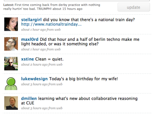
Twitter feed with author pics as main differentiating characteristic.
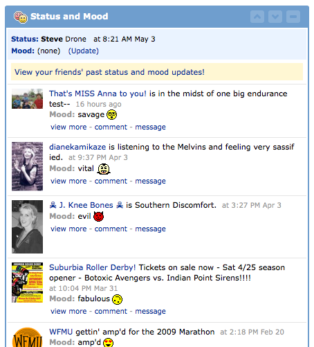
MySpace feed, also with author pics as main differentiating characteristic.
This makes sense for these apps, since the content of these feeds is mostly homogeneous. With Twitter, merely status declaration. With MySpace: Same. Thus, one can scan and select to read based on how much one actually cares about the author of the activity bleep.
With Facebook, though, it’s a little more complex, as users are also posting links to images, Websites, and whatnot, in addition to simple declarations of status.
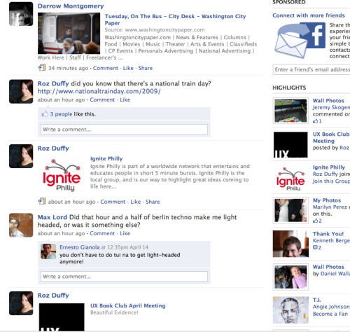
Facebook feed, also with left-hand author images, but more variance in what appears in the feed (links, video, images, etc.).
That heterogeneity of content starts to make the feed more visually confused and difficult to scan. In fact, I would argue the various graphics and links start to overshadow the simple status declarations.
Which brings us to Friendfeed. When it launched, FriendFeed’s design implied that it was actually the originating application that was most important. You could scan app icons for Twitter, or del.icio.us, or whatever, and then read title and author if the application was something interesting to you.
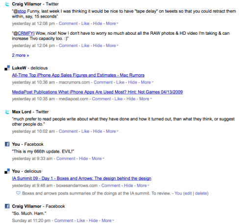
Old FriendFeed design, placing emphasis on icons for the originating applications.
But now FriendFeed has switched to be more Twitter-like, with author images as the key differentiating aspect of each activity bleep. The originating app is significantly downplayed.
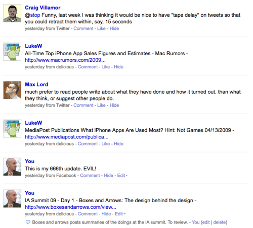
New FriendFeed design, emphasizing author images.
What’s interesting here is that the implication is, again, I only really care about the author of the bleep, and much less than in where that bleep originated from.
Alright, back to our questions. “When scanning a stack of activity feed items, what visual cue is the user looking for to indicate that a certain feed merits more attention?” Well, in FriendFeed or any other heterogeneous activity feed, I would argue that the reader is equally interested in: author, originating application, and title of the bleep.
This would go doubly in, say, the enterprise context, where I might be much more interested in seeing all activity from, say, a wiki, and filter (in my mind) next on author or title.
Next question: “What does that imply for how activity feeds should be designed?” Well, a good design would be able to allow users to self-select what they’re scanning on, any of those three characteristics, and allow equally easy scanning, depending.
What would that look like? Well, uhhh. Here’s a quick stab at redesigning the FriendFeed stream to allow users to scan on any of those three characteristics.
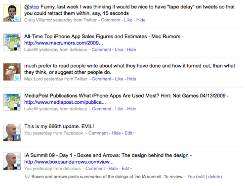
Five-minute redesign of FriendFeed.
Essentially this design makes the following arguments:
- The mind will still scan primarily on author icon. The embedded originating-app icon will give a bit more context before the user scans the item title.
- If author icon and app icon were enough to pause the reader in his scan, go straight into the item title where user can get full information.
- Note that author name is significantly downplayed (in gray at bottom rather than large link in front of item title). This assumes that once you see the icon, you know who the author is, and repeating it just gets in the way of the scan.
Not sure it really works, but I do think that depending on the intent of the user, it’s difficult to say categorically that author or originating app or title is most important, so a good design should be able to communicate all three. Thoughts?
Filed under: Uncategorized | 4 Comments
Steve,
good post. couple of quick thoughts (that sounds familiar). the notion of being identified by your icon and not your name is intriguing. I have friends who change their icon image on a weekly or daily basis. Is the notion of personal brands becoming a real issue in so far as the image we choose for our icon becomes our symbolic signifier to the entire world?
In the enterprise context this becomes an even more interesting item. Would an enterprise need to create policies around what could / couldn’t be used as the icon image? honestly that conversation interests me less, but the idea of how frequently you change it could become more significant in the enterprise.
Also the notion that everyone reads left to right is fairly western centric of you, no? This is an easy idea to blow off but as the world gets smaller and the real markets for these types of applications / designs begins to encompass the large eastern markets will that force some sort of re-thinking? Will stream design need to be geographically sensitive like language?
Great blog here! Also your site loads up fast! What web
host are you using? Can I get your affiliate link to your host?
I wish my website loaded up as fast as yours lol
It is in point of fact a great and helpful piece of information. I’m
happy that you simply shared this helpful info with us.
Please stay us informed like this. Thank you for
sharing.