Brief Thoughts on the Windows Phone UX Guidelines
The Windows Phone UX guidelines have just come out, and they make for interesting reading. Read on for a few quick comments on items of note.
Also, check out Luke W’s writeup of the Windows Phone UI and Design Language presentation from MIX10. Some of the points raised there (obviously) come through in the UX guidelines doc (official title: UI Design and Interaction Guide for Windows Phone 7 Series (pdf)).
Novel Interactions
First off, while the touch gestures obviously borrow a page or 200 from Apple, there are two slick little UI interactions/features that seem pretty novel.
One is, Panorama Application allows for apps that stretch beyond the dimensions of the phone, allowing a user to pan across the an application that is “wider” than the phone. Seems cool…I wonder how usable / useful it really will be in practice.
Second, Pivot Control allows for “filtering large data sets, viewing multiple data sets, or switching application views.” It’s basically a nifty way to pan across multiple viewing options which then affect the view that appears on the page below. This is especially handy for large filter sets…you don’t need to squeeze the type in to the width of the phone dimensions, you can just use the pivot control to pan across them and make your selection. Not bad.
Type Geeks Swoon
Font nerds will exult at the following sentence, at the top of paragraph 1 in the guidelines: “The [UI] design principles center on a look that uses type to echo the visual language of airport and metro system signage.” (p1). Type! AND public transit! In one UI! Pardon me while weep with joy!
Nerdism Comes with a Cost
They’re serious about that type. Changes to the UI are apparently limited colors only; specifically “background colors and accent colors.” (p 27). No type changes, no layout changes, nada. Hope you like airport signage, buddy.
Real World? No Thank You.
They don’t dwell on it, but there’s an interesting aside that “You should use digital metaphors where appropriate and do not necessarily try to mimic real world interaction if it is not appropriate.” (p6) This would appear to be at odds with the iPad’s movement toward mimicking the natural world, and I’m inclined to agree with Microsoft (did I just say that?).
Make it Smoov
The guidelines stress that movement and transition of the UI should be smooth, with no lag time (p7). They could just as easily have said: “Make sure it’s as smooth as the iPhone.” But, that’s a big deal. I’ve got my problems with how Apple is a fearsome gatekeeper for its devices, but the iPhone UI is absolutely silky smooth. I want to like Android, I do, but it lags. iPhone doesn’t. We’ll see if Windows Phone can measure up.
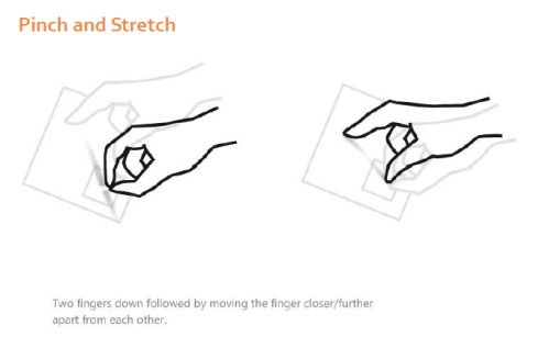
Oh, That’s How I Pinch and Stretch?
The guidelines have nice little graphics of the supported touch gestures, like:
Near as I can tell, there’s almost nothing “new” here that iPhone doesn’t do. “Touch and Hold” perhaps, as it calls up context menus or options pages, which iPhone’s don’t have.
The Back Button That Never Goes Away
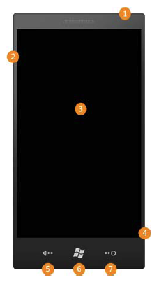
Windows phone will have a hardware “back” button, which I’m increasingly fond of after playing with Android phones. It’s nice to be able to have that “back up” ability in your app without having to take up space for it on every single page of the app.
Make the English Professor in Me Smile
There’s a entire section on “voice and tone” of the writing in your app, and on proper capitalization and punctuation! It’s like I died and went to copy-editor heaven. Sure, it’s at the very, very end, where no one will read it, but still!
In Summary
So of course I haven’t even played with the UI yet, and they were hardly the first to produce UI guidelines for mobile devices, but I think Microsoft has done a nice little job here. We’ll see how it plays when the phones actually come out, but I would make this observation: Windows Mobile 6.x has roughly 15% market share, and it’s terrible! Just awful! I’d say that if Windows Phone is even half as good as it looks, MS could start gaining market share again.
Filed under: Uncategorized | 3 Comments


Great work! This is the kind of information that should be shared around the web.
Disgrace on Google for no longer positioning this
put up higher! Come on over and talk over with my website .
Thank you =)
The first G-Shock watch was stated in April 1983 by the Japanese watch brand Casio.
In other words, you are not likely to find another distinctive line of watches
that keeps for the same standard. They likewise
have the feature of alarms which it is possible to set,
creating a choice of different sounding bleeps, and a battery that can last up to a couple of years.
Such a purifier has multiple functions, from which you can benefit a lot.
Pick the right unit and you will enjoy clean indoor air for years to come.
Blueair air purifiers were founded in Sweden in 1996.